After watching a photography workshop all weekend about marketing,
I was struck with ambition to change up my website yet again….
this time I wanted a new, meaningful logo too.
Today I want to share the process and explain the meaning behind my new look.
My brother from Cole Denver Designs helped bring my vision to life.
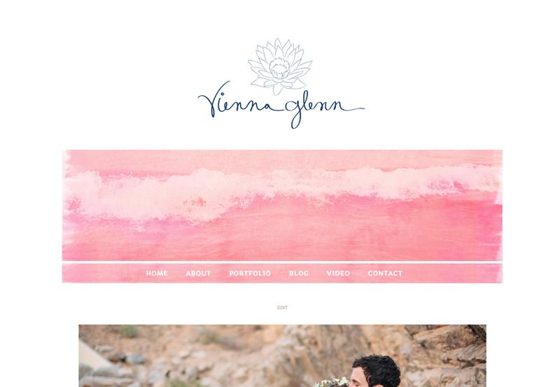
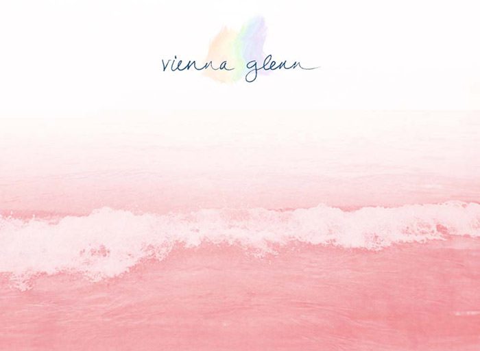
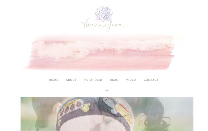
The three elements of my new logo, waves, lotus, and the colors behind the lotus,
were all separate ideas, that somehow merged together….
Last weekend, I was looking at my bookshelf and a wedding album
with the cover of Lake Superior waves caught my eye.
It’s a simple image,
but I have always been drawn to this specific image since I captured it last summer.
I grew up on Lake Superior so naturally,
the lake is very important to me.
The first idea:

Secondly, the lotus is an important symbol in spirituality.
The lotus is beautiful flower that grows from dark, murky water.
That is likened to the ego and soul within our bodies.
Our ego is the murky water as it is the center of anger, jealousy, judgment, separation,
yet our body also houses our beautiful soul, which is the lotus.

Lastly, in the past 6 months, I have been seeing many “sundogs” in the sky
(mini rainbows in the clouds).
There is (kind of) a scientific explanation to sundogs,
but sometimes I see the rainbow in places where the scientific explanation doesn’t make sense….
So sundogs have become little miracles to me….
a wonder and amazement of the Earth and Universe.


But I asked a friend for an opinion
and she helped me realize I wouldn’t want my brand 100% gay pride (although I do support gay pride),
so the sundog was switched to having only two colors:


But something felt like it was missing…….
So I placed the sundog behind the lotus!

And we found the Winner!!!
I am so in love with my new image because its simple, clean, and SO SPECIAL to my heart.
